Neutral Compositions
In design, neutrality is often mistaken for simplicity. But a well-balanced, neutral composition is more than just a muted palette, it’s about creating harmony, contrast, and depth without overpowering a space. With the right materials, shapes, and textures, neutral elements form the foundation of a refined and timeless aesthetic.
Neutral compositions allow key elements like plants, architectural details, and natural light, to take centre stage. Rather than demanding attention, they provide a soft framework that enhances everything around them. This balance is what makes neutral design so versatile, fitting seamlessly into both contemporary and classic spaces.

Materials and Texture: Adding Dimension
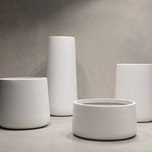
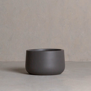
A neutral palette doesn’t mean flat or uninspired. Texture plays a crucial role in creating depth within a space. Matte finishes, soft curves, and raw, organic surfaces add visual interest without disrupting the calmness of a neutral composition. In Hibernate’s collection, lightweight fiberglass pots in subtle tones like Salt, Slate, Stone, and Clay offer the perfect base, blending effortlessly with both greenery and architectural surroundings.
Form and Balance: The Role of Shape
Beyond colour, shape is essential in achieving a cohesive design. Whether it’s the classic curves of the 86 Degrees pot or the strong, architectural lines of the Low Line planters, form influences the flow and visual weight of a space. By mixing and matching different pot shapes within a neutral palette, you can create subtle contrast while maintaining overall harmony.


A Lasting Impression
Neutral compositions stand the test of time because they aren’t tied to fleeting trends. They offer a sense of stillness and sophistication, allowing spaces to evolve around them. With Hibernate’s thoughtfully designed collection, you can curate a space where neutral elements work as a foundation, letting nature and architecture take the lead.

Courland House photographed by Nicholas Watt
Explore the Neutral Compositions Edit
Hibernate 87 Degrees U Jar Non Hanging Slate
From $110 /